For this unit I created a movie poster, dvd sleeve and a magazine front cover. To create these I had to use photoshop so my knowledge of this software was developed during this unit.
The first thing I created was a movie poster. I had free reign as to what genre of film we could create, I chose fantasy specifically superhero movies. I then had to research into existing movie posters for this same genre so I could make mine as realistic as possible. Any images of people on the poster, I had to take myself so I chose the people I wanted in my poster and positioned them in front of a green screen and used a canon 1000D camera to take the photographs. I then had to research into what fonts would look best for that genre and what colours would work best. I added special effects to the images I put in my poster so that they looked more like superheroes and fitting to my genre. The most challenging part in creating my movie poster was finding an appropriate font for my genre since superhero movies don't really have a specific font type. To resolve this problem I searched on Dafont to find an appropriate font for the poster and eventually found one that would be appropriate if I erased the un-needed line surrounding the font. I then looked onto the BBFC website to find the appropriate age ration for my film, once I found that I added the rating onto my poster. I think my movie poster was effective as everyone who looks at it would be able to tell that it is a movie poster and it is about superheroes. To improve next time, I would try to take better photographs and would play around with positions of the characters as I have them all facing toward the left instead of towards the leader.
After I created my movie poster, I had to create a dvd sleeve as well. I had to research dvd sleeve for movies with the same genre. Before I created my dvd sleeve we had to get an existing dvd sleeve and find out the measurements so that it was as realistic as possible. For my dvd sleeve I took the background of my poster and made that the background of the front of my dvd sleeve. I then made the background on the rest of my dvd sleeve black to symbolise the shadows of my villain. I then took the same people from my poster and positioned them on my dvd sleeve front page. I then had to take more photographs of two of the characters so that I could have images form scenes in the film on the back of the sleeve. The most challenging part of making my dvd sleeve was trying to figure out what logos go on the dvd sleeve to make it look real. To resolve this I looked at a dvd sleeve of a film similar to the one I was making and saw what logos was on that and used similar ones that I found on google, for example Technicolor. I then had to add a blurb describing the plot of the film and added that to the back of the sleeve. I think my dvd sleeve resembles a sleeve of a superhero movie and would be easily recognised as that. To improve next time, I would play around with positions of my characters on the front and have them facing the leader. I would also try to improve the back of my dvd sleeve by adding more detail as it seems simple.
The last thing I created was my magazine front cover. I first had to research into magazine front covers of movie magazines. I then took another photograph of one of my characters but this time of the person as himself instead of the character and added that on the front of my magazine. I then looked on Dafont for a big, chunky font for my magazine as most movie posters have chunky fonts. I finally found one and called my magazine 'The Lens' as a play on looking through a lens to analyse and a camera lens. By using the same person in all three it helped people to recognise that they are connected. The most challenging part of making my front cover was composition. Sometimes I had too much space or too little space and it was hard to find a balance. To resolve this I looked more closely at the composition of other movie magazines and made mine similar. I think my magazine looked like a real movie magazine front cover when I was finished and it was recognisable as being about my film. To improve next time, I would try to use a better colour palette and try to have a better composition as I still feel there is some spaces.
Tuesday 30 June 2015
Wednesday 24 June 2015
Vector vs bitmap
File Formats
Vector Images


Conclusion
There are different file formats
that are used for specific pieces in media and graphic imagery. The formats
are;
•Raster
•Vector
•Metafile.
The file formats are used when
saving something like images. The format depends on what the
image is being used for.
Vector Images
Vector images are useful because
they always maintain quality no matter how big or little you scale it. It also
takes up less data than a bitmap image. If you planned on creating an image
that needs a lot of detail then it would be wise to use vector imagery.
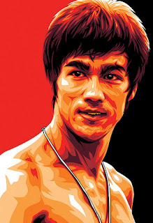
Examples of Vector Images:


Raster Images
Bitmap images or Raster Imagery,
take up a lot of data because they have a set amount of pixels. Since they have
a set amount of pixels, they do not maintain quality when rescaled. If you
require to create a logo that doesn’t need a lot of detail then it is wise to
use Raster imagery.
Examples of Raster imagery:


Conclusion
Vector is best used when creating
something with a lot of detail such as, certain logos, text, borders,
illustrations ect. This is because vector images
always maintain quality and allows smoother edits if needed.
Bitmap is best used when creating something
with a set size such as, certain logos, photography and video. This is because
the files take up a lot of data so they become compressed and saved as a raster
image.
A Metafile is an in between state
of Vector and Bitmap. Examples of these would be magazines, DVD Sleeves, Movie
Posters ect. It would be used when both text
and imagery are needed.
Subscribe to:
Posts (Atom)