For this unit I created a movie poster, dvd sleeve and a magazine front cover. To create these I had to use photoshop so my knowledge of this software was developed during this unit.
The first thing I created was a movie poster. I had free reign as to what genre of film we could create, I chose fantasy specifically superhero movies. I then had to research into existing movie posters for this same genre so I could make mine as realistic as possible. Any images of people on the poster, I had to take myself so I chose the people I wanted in my poster and positioned them in front of a green screen and used a canon 1000D camera to take the photographs. I then had to research into what fonts would look best for that genre and what colours would work best. I added special effects to the images I put in my poster so that they looked more like superheroes and fitting to my genre. The most challenging part in creating my movie poster was finding an appropriate font for my genre since superhero movies don't really have a specific font type. To resolve this problem I searched on Dafont to find an appropriate font for the poster and eventually found one that would be appropriate if I erased the un-needed line surrounding the font. I then looked onto the BBFC website to find the appropriate age ration for my film, once I found that I added the rating onto my poster. I think my movie poster was effective as everyone who looks at it would be able to tell that it is a movie poster and it is about superheroes. To improve next time, I would try to take better photographs and would play around with positions of the characters as I have them all facing toward the left instead of towards the leader.
After I created my movie poster, I had to create a dvd sleeve as well. I had to research dvd sleeve for movies with the same genre. Before I created my dvd sleeve we had to get an existing dvd sleeve and find out the measurements so that it was as realistic as possible. For my dvd sleeve I took the background of my poster and made that the background of the front of my dvd sleeve. I then made the background on the rest of my dvd sleeve black to symbolise the shadows of my villain. I then took the same people from my poster and positioned them on my dvd sleeve front page. I then had to take more photographs of two of the characters so that I could have images form scenes in the film on the back of the sleeve. The most challenging part of making my dvd sleeve was trying to figure out what logos go on the dvd sleeve to make it look real. To resolve this I looked at a dvd sleeve of a film similar to the one I was making and saw what logos was on that and used similar ones that I found on google, for example Technicolor. I then had to add a blurb describing the plot of the film and added that to the back of the sleeve. I think my dvd sleeve resembles a sleeve of a superhero movie and would be easily recognised as that. To improve next time, I would play around with positions of my characters on the front and have them facing the leader. I would also try to improve the back of my dvd sleeve by adding more detail as it seems simple.
The last thing I created was my magazine front cover. I first had to research into magazine front covers of movie magazines. I then took another photograph of one of my characters but this time of the person as himself instead of the character and added that on the front of my magazine. I then looked on Dafont for a big, chunky font for my magazine as most movie posters have chunky fonts. I finally found one and called my magazine 'The Lens' as a play on looking through a lens to analyse and a camera lens. By using the same person in all three it helped people to recognise that they are connected. The most challenging part of making my front cover was composition. Sometimes I had too much space or too little space and it was hard to find a balance. To resolve this I looked more closely at the composition of other movie magazines and made mine similar. I think my magazine looked like a real movie magazine front cover when I was finished and it was recognisable as being about my film. To improve next time, I would try to use a better colour palette and try to have a better composition as I still feel there is some spaces.
Tuesday 30 June 2015
Wednesday 24 June 2015
Vector vs bitmap
File Formats
Vector Images


Conclusion
There are different file formats
that are used for specific pieces in media and graphic imagery. The formats
are;
•Raster
•Vector
•Metafile.
The file formats are used when
saving something like images. The format depends on what the
image is being used for.
Vector Images
Vector images are useful because
they always maintain quality no matter how big or little you scale it. It also
takes up less data than a bitmap image. If you planned on creating an image
that needs a lot of detail then it would be wise to use vector imagery.
Examples of Vector Images:


Raster Images
Bitmap images or Raster Imagery,
take up a lot of data because they have a set amount of pixels. Since they have
a set amount of pixels, they do not maintain quality when rescaled. If you
require to create a logo that doesn’t need a lot of detail then it is wise to
use Raster imagery.
Examples of Raster imagery:


Conclusion
Vector is best used when creating
something with a lot of detail such as, certain logos, text, borders,
illustrations ect. This is because vector images
always maintain quality and allows smoother edits if needed.
Bitmap is best used when creating something
with a set size such as, certain logos, photography and video. This is because
the files take up a lot of data so they become compressed and saved as a raster
image.
A Metafile is an in between state
of Vector and Bitmap. Examples of these would be magazines, DVD Sleeves, Movie
Posters ect. It would be used when both text
and imagery are needed.
Wednesday 19 March 2014
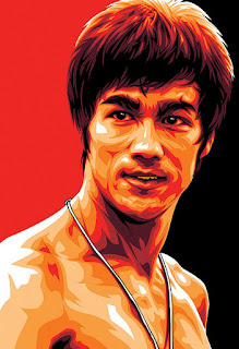
Final Film Poster
After discussing with my graphics teacher, we came to the conclusion that my film poster wasn't up to the standards it could be so I started another one. This post will just be a before and after.


Before:

After:

As you can see, the second one is definitely better than the first.
Friday 13 December 2013
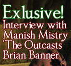
My Magazine Front Cover

I named my magazine The Lens because it is a movie magazine and cameras record through the lens. The title is bright, bold and chunky to attract the audiences attention, that is also why the saying 'Man Behind The Green' is written the same way.
To make my Magazine front cover, I started with the background. That was basically the same background as the poster and dvd sleeve of my movie to show readers that it is the same movie. Then I got a photo of Manish Mistry, who plays Brian Banner in my film, to have as my 'celebrity' on the front.

I then found a big chunky font from DaFont fro my title 'The Lens'. I then gave it a black stroke to make it stand out more.
Before:

After:

See, much better.
I then added the small but important information underneath the title.
I then gave it a dark red stroke so that it is easier to see what it says.
 Then I added my main subject from the magazine. The 'Man Behind The Green'. I added a black stroke whilst making the writing green.
I then started adding the titles of the other contents in the magazine. Keeping the colour theme strictly to red and green. I added a stroke to them all.


After that i added a splash, stating there is a free poster.
 Then finally, I added the barcode.
Friday 22 November 2013
DVD Sleeve for The Outcasts
This is the finished work of the DVD Sleeve I made for my film 'The Outcasts':

To start off, I got an existing DVD sleeve and measured out the length and width of all three sections so that I could have the correct shape and size for my DVD Sleeve. After I got the size I set a new canvas to that size and used two blue line markers to mark out where the spine will be.
These would not show up on the printout or the saved image.
After I had all three sections marked out, I started with the front page. The front page is simply my film poster but smaller, the position of my characters have changed slightly to fit the smaller space and some information has been moved. The information moved would be the credits bar, as that has been moved to the back page where it should be and 'From the director of Look Out!' has been removed completely.
Poster:

DVD Sleeve:

After the front page was done, I started on the spine. I started by making a black rectangle to cover the spine to keep it black and have a background for the rest of the spine information to go on. Then I made a copy of the title, turned it onto its side then placed it on the spine. I then added the marvel logo above it and I made a screen shot of Haydn's head as Captain Launcher and added a blue stroke around the picture.


After that I added another age restriction and then the spine was done. I added the picture of Haydn's head to the spine to add to the affect that it is a series film, so with each film there will be a different head.
For example, this would be next:

And finally, the back page. I started off by getting all the legal requirements out of the way.

These I got from another film, Thor who reside in the same family as a Marvel film. The stretched earth with the 2 in it is the region number. The number 2 means it is from the UK.

This means worldwide or region free.

This means United States, Canada, Bermuda, Caribbean and U.S. Territories.

This means Europe, Middle East, Egypt, Japan, South Africa, Swaziland, Lesotho, Greenland, French Overseas department and territories.

This means Southeast Asia, South Korea, Taiwan, Hong Kong and Macau.

This means South America, Central America, Mexico, New Zealand, Australia, Papua New Guinea and Oceania.
This means Bangladesh, India, Nepal, Afghanistan, Sri Lanka, Ukraine, Belarus, Russia, Kazakhstan, Pakistan, Africa (except Egypt, South Africa, Swaziland, Lesotho), Central Asia, Mongolia and North Korea.

This means China.
Once I had the region code on my dvd, I got all other legal requirements like; technicolor logo, Paramount logo, DVD logo, Dolby Digital and a barcode.
As I mentioned before, I had moved my credits bar to the back and it is placed above my legal requirements.
I then made my special features box:

 To make this box, I used the rectangle tool:
Then drew a box, the size I wanted. The fill for the box was a light blue in colour and set to 'foreground to transparent'.

 Then the line for the box was a pale yellow set to 'transparent stripes'.
Then I wrote my blurb in a green colour, next to my special features box. This was basically a summary of the film but without giving too much or the ending away.

Then I added The picture of my villain to my back page.

This picture was perfectly dark so it blended with my background well.
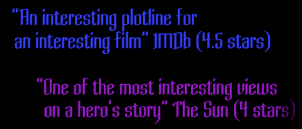 After I had my villain, I added in ratings from IMDb and The Sun.
After that, I got some more pictures of a few members of my cast and used them as my scene images. I gave them a green stroke to bring them off the background better, then positioned them under the ratings, above the blurb and over a bit off my villain.

Then the back page was done. That was how I made my DVD Sleeve.

This means Bangladesh, India, Nepal, Afghanistan, Sri Lanka, Ukraine, Belarus, Russia, Kazakhstan, Pakistan, Africa (except Egypt, South Africa, Swaziland, Lesotho), Central Asia, Mongolia and North Korea.

This means China.
Once I had the region code on my dvd, I got all other legal requirements like; technicolor logo, Paramount logo, DVD logo, Dolby Digital and a barcode.
As I mentioned before, I had moved my credits bar to the back and it is placed above my legal requirements.
I then made my special features box:
Then drew a box, the size I wanted. The fill for the box was a light blue in colour and set to 'foreground to transparent'.
Then the line for the box was a pale yellow set to 'transparent stripes'.Then I wrote my blurb in a green colour, next to my special features box. This was basically a summary of the film but without giving too much or the ending away.
Then I added The picture of my villain to my back page.

This picture was perfectly dark so it blended with my background well.
After I had my villain, I added in ratings from IMDb and The Sun.After that, I got some more pictures of a few members of my cast and used them as my scene images. I gave them a green stroke to bring them off the background better, then positioned them under the ratings, above the blurb and over a bit off my villain.

Then the back page was done. That was how I made my DVD Sleeve.
Tuesday 12 November 2013
How I made My Improved Poster

To make my film poster I started off by taking photos of my fellow students. I chose five of my classmates that I thought would portray my characters the best. When I had the photos of my five characters, I uploaded them to the mac. I opened them all in Photoshop and got the other photos I would need like the age rating and the marvel logo. Once I had them all, I used the tool magnetic lasso to go around the photo of my characters until they were selected, then I clicked the 'select' tab and selected 'inverse'.
This made the background be selected so that I could delete it. After I deleted the background of all the photos, I got my background photo for my poster. This image I got from Google images. I chose it because I wanted it to look like 'the light at the end of the tunnel' which for my poster means the acceptance of my 'outcasts' after there struggle against the villain Mandrix. Once I had my background photo, I moved the photos of my characters onto my background photo.
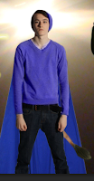
On My Captain Launcher
I changed the colour of his jumper and hat to blue as it was originally grey, I did this using the paint brush and changing the mode to colour. I also had to lower the opacity.I then added the lions tail by getting a photo of a lion's tail and using the magnetic lasso tool to go around it just like in the character photos, I then dragged it onto the background photo. I positioned it so that the layer of the lion's tail is between the layers of the cape and the Captain Launcher.
On my Brian Banner/Hulk's Son
Using the same technique I used to change Captain Launcher's jumper and hat colour, I changed the skin colour of this character. Using the paint brush I repeatedly went over the skin of this character until I got the shade of green I was looking for.On my Spacia
For this character I did the same to the skin as I did to Brian Banner, I changed the skin colour to a greyish black, which was originally going to be pitch black but the greyish black worked better. I then used this paint brush technique to change the colour of the hair, which was originally brown and changed it to purple. I also enhanced the red lips by going over them with the paint brush in red.On my Thundra
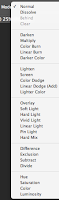
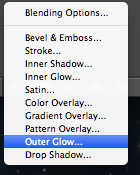
The Lightning coming off of my Thundra character took a while to do. I first got the the paint brush in full opacity (100%) and had the colour in whit and just made random jaggy/wiggly lines coming away from the body. Then I added an 'outer glow' using the fx (effects) button.On my villain Mandrix
All I did for my Mandrix character was blend him into the shadowed background.This made him more mysterious and hidden, like some villains are in posters but my aim was to show two things; He is less important than the heroes and so shouldn't be seen as easily, and I placed him in the shadowy area of the poster so it is hard to notice him. This last reason is because my villain is going to be able to control the shadows and thus can easily hide in them.
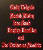
For the names of the 'stars' involved I used the same technique in my Thundra character by adding an outer glow to make the important writing stand out in front of the dark/black background.
Monday 11 November 2013
How I Made My Film Poster

To make my film poster I started off by taking photos of my fellow students. I chose five of my classmates that I thought would portray my characters the best. When I had the photos of my five characters, I uploaded them to the mac. I opened them all in photoshop and got the other photos I would need like the age rating and the marvel logo. Once I had them all, I used the tool magnetic lasso which looks like this

to go around the photo of my characters until they were selected, then I clicked the 'select' tab and selected 'inverse'.

This made the background be selected so that I could delete it. After I deleted the background of all the photos, I got my background photo for my poster. This image I got from google images. I chose it because I wanted it to look like 'the light at the end of the tunnel' which for my poster means the acceptance of my 'outcasts' after there struggle against the villain Mandrix. Once I had my background photo, I moved the photos of my characters onto my background photo. On My Captain Launcher

 I changed the colour of his jumper and hat to blue as it was originally grey, I did this using the paint brush and changing the mode to colour. I also had to lower the opacity.
 I then added the lions tail by getting a photo of a lion's tail and using the magnetic lasso tool to go around it just like in the character photos, I then dragged it onto the background photo. I positioned it so that the layer of the lion's tail is between the layers of the cape and the Captain Launcher.
On my Brian Banner/Hulk's Son
 Using the same technique I used to change Captain Launcher's jumper and hat colour, I changed the skin colour of this character. Using the paint brush I repeatedly went over the skin of this character until I got the shade of green I was looking for.
On my Spacia
 For this character I did the same to the skin as I did to Brian Banner, I changed the skin colour to a greyish black, which was originally going to be pitch black but the greyish black worked better. I then used this paint brush technique to change the colour of the hair, which was originally brown and changed it to purple. I also enhanced the red lips by going over them with the paint brush in red.
On my Thundra
 The Lightning coming off of my Thundra character took a while to do. I first got the the paint brush in full opacity (100%) and had the colour in whit and just made random jaggy/wiggly lines coming away from the body. Then I added an 'outer glow' using the fx (effects) button.

On my villain Mandrix

 All I did for my Mandrix character was just make the layer opacity less.
This made him more translucent, like most villains are in posters but my aim was to show two things; He is less important than the heroes and so shouldn't be seen as easily, and I placed him in the shadowy area of the poster so it is hard to notice him. This last reason is because my villain is going to be able to control the shadows and thus can easily hide in them. I'd be surprised if you noticed him before I mentioned him here.

For the title and other important writing I used the same technique in my Thundra character by adding an outer glow to make the important writing stand out in front of the dark/black background.
 I changed the colour of his jumper and hat to blue as it was originally grey, I did this using the paint brush and changing the mode to colour. I also had to lower the opacity.
 I then added the lions tail by getting a photo of a lion's tail and using the magnetic lasso tool to go around it just like in the character photos, I then dragged it onto the background photo. I positioned it so that the layer of the lion's tail is between the layers of the cape and the Captain Launcher.
On my Brian Banner/Hulk's Son

On my Spacia

On my Thundra

On my villain Mandrix
 All I did for my Mandrix character was just make the layer opacity less.
This made him more translucent, like most villains are in posters but my aim was to show two things; He is less important than the heroes and so shouldn't be seen as easily, and I placed him in the shadowy area of the poster so it is hard to notice him. This last reason is because my villain is going to be able to control the shadows and thus can easily hide in them. I'd be surprised if you noticed him before I mentioned him here.
For the title and other important writing I used the same technique in my Thundra character by adding an outer glow to make the important writing stand out in front of the dark/black background.
Subscribe to:
Posts (Atom)